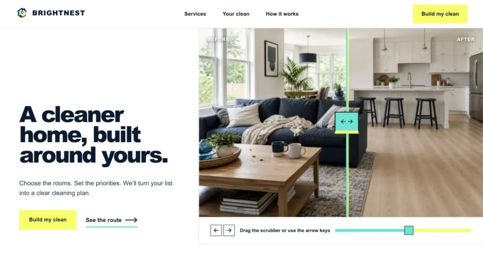
A service page is neither a digital brochure panel nor a container for every keyword variation. It is a guided buying conversation for someone with a specific problem and a specific level of readiness. The page should identify the offer, qualify fit, explain delivery, support important claims, and make the next step safe and obvious. At the same time, it should give search systems one coherent subject they can discover and understand. This anatomy is a planning sequence, not a rigid template: keep the parts that resolve a real customer question and remove anything that exists only to make the page look longer.
The central ideaA high-performing service page makes a specific offer easy to understand, trust, navigate, and act on. Build it around real buying questions, transparent scope, truthful evidence, an accessible next step, a coherent technical structure, and qualified outcomes. Review the page as the service and customer questions change; do not confuse keyword repetition, raw traffic, or a schema badge with useful performance.
Orient the visitor before asking for action
Open with the service in plain language, the customer or situation it serves, and the practical outcome the team helps create. Add the relevant location or delivery model when it affects eligibility. A clever slogan may support the brand, but it should not force a hurried visitor to infer what the company sells. The main heading, introductory copy, and page title should describe the same core offer without repeating an exact phrase unnaturally.
Choose one primary next step that matches the buying stage: request an estimate, schedule a consultation, check availability, or call for urgent service. State what happens after the action and how much information is required. A secondary route can serve someone who needs proof or details first, but several equally loud buttons create a decision rather than resolving one. Keep phone and form options usable on small screens.
Check the opening against a concrete scenario. A property manager searching for an emergency repair needs eligibility, response area, and a call option immediately; a company considering a six-month redesign may need to understand approach and view relevant work before scheduling. Both pages can have a strong call to action, but they should not use the same urgency or sequence. Match the promise to what the business can deliver, especially when availability, geography, or response time changes.
- Specific service, suitable customer, and useful outcome
- Truthful location, service area, or remote-delivery context
- One primary action with clear follow-up expectations
- Readable mobile layout and accessible controls
Define scope, fit, process, and price expectations
Describe what is included, meaningful options, normal exclusions, and the information needed to quote or begin. Use customer language, but preserve technical detail when it changes the decision. If the service only fits certain properties, budgets, project stages, schedules, or geographic areas, say so respectfully. Good qualification can reduce unsuitable inquiries while making a suitable customer more confident.
Show the process in a realistic number of steps and identify the customer’s responsibilities. Explain consultation, assessment, proposal, preparation, delivery, review, and support only where they apply. If a fixed price is not responsible, describe the variables that shape it and when the customer receives a figure. Vague “contact for pricing” copy leaves the hardest question unanswered; a fabricated starting price creates a different problem.
Use the frequently asked questions gathered by sales and delivery teams to find gaps, but answer major buying questions in the main page rather than hiding everything in an accordion. Clarify timelines as ranges or stages only when the business can support them. Explain what causes delay, what the customer supplies, and what completion means. A transparent exclusion can build confidence: telling a prospect that permit fees, specialist copy, or after-hours work require separate approval is more useful than an apparently unlimited promise.
Place evidence beside the claims it supports
Use authentic project examples, before-and-after context, work samples, credentials, team experience, warranties, or review excerpts where they are accurate and permitted. Explain the situation and the relevant work instead of presenting a logo wall with no meaning. A testimonial about responsiveness belongs near the process; a case study about a particular service belongs near that service’s outcome.
Avoid absolute claims such as guaranteed results, universal savings, or “number one” unless the business has current, verifiable evidence and the statement is properly qualified. Do not invent local projects, testimonials, awards, or certifications. Link to fuller portfolio material when a visitor needs detail, and date time-sensitive proof. Trust grows when evidence is specific enough to inspect and modest enough to believe.
Make the source and boundaries of every number understandable. If a case study reports more inquiries, define the period, what counted as an inquiry, and which other changes occurred. If a review is shortened, preserve its meaning and identify the platform or customer with permission. If confidentiality prevents naming a client, explain the constraint rather than constructing a disguised testimonial. Evidence does not need to be dramatic; a clearly documented process or representative deliverable can answer risk more honestly than an unsupported percentage.
- Evidence connected directly to an important claim
- Permission and context for customer material and images
- Qualifications and guarantees stated with accurate limits
- Detailed project proof linked when the summary is not enough
Create a clear search and navigation structure
Give a distinct service its own stable URL, concise page title, descriptive main heading, and unique summary. Use subheadings to organize real questions rather than synonyms. Link from the service hub, related services, relevant projects, and helpful articles with anchor text that names the destination. A visible breadcrumb can show the path from home to services to the current offer and give visitors a quick route back.
Add a location page only when the business can provide distinct, truthful local information; otherwise state the genuine coverage on the service page. Keep contact facts aligned with the Business Profile. Structured data can clarify supported visible facts and breadcrumbs, but it does not replace content or guarantee a special result. Mark up only the type and properties documented for the page and test the deployed version.
Decide the primary page before similar URLs accumulate. Tracking parameters, print views, filtered lists, HTTP variants, and copied campaign pages can create competing versions. Use consistent internal links, redirects for permanent moves, and canonical signals where appropriate, then include the preferred URL in the sitemap. For bilingual services, each language needs an actual translation on its own URL plus reciprocal language annotations; translating only the navigation while leaving the service body unchanged is not a useful localized experience.
Remove friction from content, performance, and contact
Test the page on common phones and connections. Compress appropriate images, reserve media dimensions, label fields, explain errors, preserve keyboard focus, and confirm that calls, forms, booking tools, privacy links, and success messages work. Ask only for information the team will use at that stage. If a form requests sensitive details, review the collection, storage, access, consent, and retention process before launch.
Edit for scanning without reducing the page to fragments. Lead sections with useful statements, keep paragraphs focused, use lists for comparable items, and define unfamiliar terms. Images should explain the service or show credible work rather than act as decoration between headings. Avoid intrusive overlays that cover the explanation or contact controls. A sticky action may help on a long mobile page, but it still needs an accessible name, enough space, and a route that works without animation.
Treat performance as part of the content plan. Oversized hero media, several review widgets, maps, chat tools, scheduling embeds, and advertising scripts can all compete for a visitor’s device and attention. Add third parties only when their job is clear, delay nonessential work when appropriate, and observe real-user performance after launch. Core Web Vitals are useful diagnostics for loading, responsiveness, and visual stability, not a substitute for usability testing or a guarantee of search visibility.
- Working calls, forms, bookings, errors, and confirmations
- Accessible labels, focus behavior, contrast, and tap targets
- Scannable copy and media that serves a clear purpose
- Third-party scripts and real-user performance reviewed
Measure whether the page creates suitable opportunities
Define success before the page launches. Track completed calls, forms, bookings, or quote requests rather than button clicks alone, then connect those actions with the requested service, customer fit, and eventual outcome when lawful and practical. Annotate changes to forms, offers, campaigns, tracking, and business availability. Without that context, a rise or fall in monthly conversions may be attributed to copy when the actual cause was seasonality or an operational change.
Review search landing visits, completed actions, qualification, sales feedback, and customer questions together. A traffic total cannot rescue an unclear scope or a stream of requests the business cannot serve. Segment carefully enough to diagnose, but avoid drawing conclusions from tiny samples. Record a hypothesis, make one meaningful change when possible, define the observation window in advance, and preserve the old version. Conversion improvement is an operating discipline, not a promise that one headline wins forever.
Use findings to strengthen the complete journey. If suitable visitors abandon a long form, reduce or postpone questions. If callers repeatedly misunderstand geography, clarify the area near the opening and contact action. If a page attracts the wrong service inquiry, revisit positioning and internal links before chasing more traffic. Schedule periodic factual reviews for scope, prices, credentials, team members, examples, and availability so the page remains trustworthy after its initial optimization work ends.
- Completed conversions separated from attempted interactions
- Lead suitability and sales outcomes reviewed with traffic
- Changes, campaigns, seasonality, and availability annotated
- Factual accuracy and customer questions reviewed on a schedule